For most start-ups and small businesses, your website plays a crucial role in informing, educating, and generating sales leads.
At least that’s how the story goes. In reality, the facts are often very different.
Even today, when you’d think that most everyone get how important the company website is, few businesses actually know with any certainty where (for example) their website visitors have come from, what pages they look at, how much of each page they’re reading – and how to optimize their pages.
‘Waving A Wet Finger In The Air’ When Designing Your Site

Many business owners make decisions on the website – its design, layout, and content – based on little more than gut feeling.
They’re waving a wet finger in the air to find out which way the wind’s blowing. They decide on content presentation based on guesstimates, hunches – and probably bit of voodoo thrown in there for good measure.
The problem with filling your site with content that you think is what your audience wants, and not implementing any form of measurement to either support or refute your assumptions, is that you end up with web content that you want – rather than what they want.
But that’s not who the website is designed for.
You Are Not Your Target Audience
We see this time and time again, whenever we’re called-in to help a company rework a site that’s not (or no longer) paying its way.
The site may look great. But as you look more closely, you get the impression that the content has been crafted for the explicit purpose of pleasing the CEO – since she’s the person who will ultimately sign-off on the project.
But the CEO is not your target audience. Your target audience is your target audience.
Hard as it may be to swallow (and no doubt implement) it’s not important for the boss to like the website. It’s only important that the customers do. As long as the website is doing its job, then where’s the issue?
It shouldn’t be important for the management team, shareholders, or even the marketing department to love the website. That’s not who the site is designed to attract. The site needs to resonate with customers.
Taking The Right Measurements When Optimizing for Site Conversions

“I’ve got Google Analytics installed on my website. Now what I am supposed to do?”
“Oh, all this stuff doesn’t apply to me,” I hear you say. “I’ve got Google Analytics running on my site, so I know which of my pages get the most traffic.”
Good for you. Give yourself a gold star. Now: why don’t you tell me what you’re doing with all that information? Do you know why that page gets more hits than the others? In fact, are the number of page views the most important thing to measure on that page, or could there be other metrics to check that may bring more benefit?
Measurement utilities such as Google Analytics are immensely powerful tools. But – as well all know – with great power comes great responsibility…
One problem with site tracking services such as Google Analytics is that it’s been designed by engineers. But that I mean at first glance it looks so complicated that you’d think you need a doctorate in quantum mechanics to set the thing up.
As a result of its non user-friendliness, most people just focus on on a couple of the more obvious metrics – and invariably end up concentrating on the wrong ones.
Vanity Metrics: Measuring The Easy Things Instead Of The Right Things
Let me give you an example. Supposing you’re monitoring views of your “Contact Us” page that contains, amongst other things, a form that visitors are invited to complete. If you decided to include the URL of your Contact page in your email signature, have it as the link on a few business networking sites, plus running an Google Ads campaign, it’s not a real stretch of the imagination to assume that the number of views of that page will rise, right?
But can the above example be deemed a success? After all, you got more people to visit that particular page, didn’t you?
Monitoring the amount of traffic to that page, without overlaying any semblance of context, doesn’t really tell you much on its own. It’s a “vanity metric”. Sure, it’s a nice big number to quote on a PowerPoint slide or to put in a shareholders report. But it’s not really that useful unless it’s aligned with a tangible business outcome.
You got a bunch more eyeballs on your Contact page? Big deal. There are a ton of people online who’ll give you thousands of pageviews to any page you want in exchange for the cost of a cup of coffee. None of those views are going to result in more people filling-in the form on your Contact page. That means you haven’t increased the number of leads for your sales team. You’ve increased pageviews, but it hasn’t led to a positive result for the business. So why on earth are you measuring pageviews as some kind of success indicator? It means nothing.
What would be far more interesting would be to measure conversion rate. For example:
- How many people filled-in the contact form, compared to how many people visited the page? How does that ratio compare to last week/month/quarter?
- Did you get more conversions from people who found that page on their own, or from your email signature link?
- How many pages did they visit before they came to your contact page? What subjects did those pages cover?
- Based on the feedback of the sales team who followed-up on the inquiries that were generated, how good were the quality of the leads?
Do you see where I’m coming from?
If you get 10,000 people to visit your page, that’s great. But if 90% of them left your site without visiting another page and only 5 of them bothered to fill-in the form, that’s pretty lousy.
Conversion Rate Optimization
Every one of your web pages needs to have a raison d’être – a reason as to why it exists. You want your visitor to do something as a result of reading/watching that page.
In marketing-speak, we call that a Call To Action. Maybe you want them to click the ‘buy’ button. Maybe you want them to complete a form. Maybe you want them to call you. Whatever that action is, you can call it a “conversion”. Its goal is to indicate the previously passive state of the visitor has been moved to an active one.
Falling under one of the tasks of a new marketing/tech role that has become colloquially known as “Growth Hacking“, conversion rate optimization (CRO) can be summarized as:
- Finding out why your visitors aren’t doing what you want them to do on your site, and
- Fixing it.
However, unlike the waving of wet fingers or listening to the HiPPO, Conversion Rate Optimization is based on cold, hard facts. It’s a structured and systematic approach that takes in analytics, user feedback, and testing to determine the best approach for maximizing the potential “conversion rate” of a particular page.
The world of CRO is filled with strange new words and jargon such as A/B Testing, heatmapping, and Fitt’s Law. At the heart of CRO is the combination of the objective with the subjective – making creative decisions and changes based upon quantitative data.
Sure, CRO embraces technical topics such as search engine optimization, site structure, and mobile device friendliness. But it also brings in disciplines such as cultural expectations and differences, design, typography, color theory, language, and even psychology and behavioral sciences.
There’s a raft of software and services to help you identify the important conversion factors. One of the services we use for CRO work creates videos – such as this one showing an anonymous user navigating the KEXINO site (click the image below to view the video):
The video clearly shows the “trail” of their mouse cursor, what they clicked on, which pages they visited – for how long – and how far they scrolled on each page. Using video captures like this allows you to see what content is deemed important and how users navigate your site. Understanding the customer journey allows you to better collate and present your information to convert at the highest level possible.
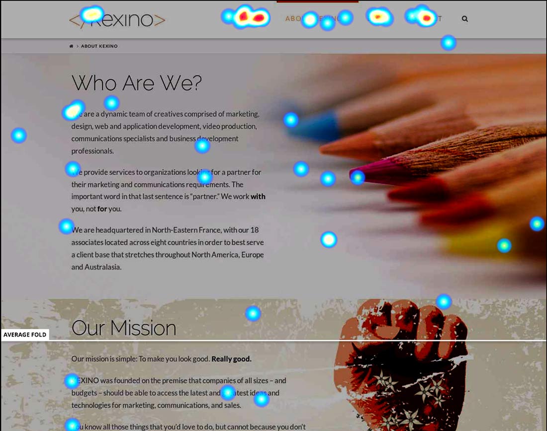
Another tool in the Conversion Rate Optimization toolbox are heatmap images. Here’s a heatmap of our “About Us” page. The colored areas show where visitors have clicked. Blue means fewer clicks, red means more clicks:

Information like this can be used to create different variations on content, design, whatever – and the results compared.
Analytics services such as the above have become surprisingly affordable over the past few years. Our current favorite is Hotjar, who offer heatmaps, site recordings, funnels and web form tracking. They even offer a free tier.
ABT: Always Be Testing
The skills required for effective Conversion Rate Optimization are many and varied. CRO involves visual design, copywriting, User Experience (UX), technical expertise, and even psychology and sociology. How important CRO for your particular site depends on how dependent you are for your website to generation leads/sales/whatever for your business. You can either continue to make guessing and assumptions. Or you can apply a structured, data-driven approach.
One thing to bear in mind: data only gets you so far. Blindly following data without applying human-based reasoning as to what the underlying reasons may be for why someone behaves in a certain way is not just lazy. It’s dangerous.
The goal is to use and interpret the data to form insights, and confirm assumptions. Site measurement tools are just that: tools. They’re there to help you test ideas and validate theories.
A supermarket knows exactly which shelf, on which aisle, to put the cans of baked beans. They didn’t come to that decision by accident. Every business that relies on its site for visibility or any form of lead generation should be testing their pages every so often.
However great you think your pages are doing, I’ll bet you they could be doing better.
Recent articles:
Dark Social: The Hidden Conversations Marketers Can’t See

Marketing In A Recession: How To Weather The Storm

How To Convince A Marketing Skeptic

Privacy Protection: Why Ad Tracking Must End

Marketing Isn’t About Being Brave: It’s About Being Effective

Why Seeking Consensus Prevents Business Innovation


