Part of our work here at KEXINO is taken up with reformulating a company’s client-facing value, of which a key component part is the quality of their business presentations.
It’s amazing that, in a business world where the efficient visual creation and dissemination of ideas continues to grow in importance, so few business professionals are any good at presenting. Business schools teach you the difference between sales and revenue, or marketing and advertising.
But none of them will teach you about the theatre involved with making a great business presentation (though we think starting with Post-It notes is a great beginning). Great speakers know that presentations are showbiz. There’s a story to tell, a beginning, middle, and an ending. There needs to be highs and lows. Effective delivery of the information, sure. But delivered in a format that’s in alignment with audience expectation, while at the same time riding on the back of basic human storytelling in order to have the message sink in, and be remembered.
Business Presentations To Tell A Story
Anyone who has ever been at a conference or seminar knows how bad a business presentation can be: Overly-long, boring delivery using stock presentation templates, too much text on each slide and presenters reading the slide’s content out loud. Part of what we do at KEXINO is re-engineer a company’s corporate or product presentation to allow the message to speak more clearly by the use of design, imagery, motion graphics, video and type.
Some years ago I was asked to give a sales presentation at a printing industry conference. The company I was representing at the time were one of the sponsors of the event. Part of their sponsor package was the opportunity to pitch their wares to the conference attendees at various breaks during the 3 days of the event.
The speaking slots were allocated at random. Some sponsors got to speak at the beginning of the day, some at the end. Some were awarded a slot during one of the coffee breaks. Our company, however, drew the shortest of straws: we were due to speak during the lunchbreak.
Luckily I knew the slot I had to work with weeks before, so I prepared the presentation accordingly. I knew that presenting to 600 people while they were eating their lunch was going to be tough. I knew I couldn’t go through the motions with a stock business presentation, heavily laden with corporate BS and text-heavy slides. No-one would be paying any attention.
Get Their Attention, Then Keep That Attention
Attention was the key. I had to deliver something that could complete with whatever was on their plate. A tall order, right?
I worked on the presentation for six weeks straight. I tweaked and edited the script, visuals, and slide order. I rehearsed for hours. I created a strong storyline and weaved the images around it. There was video, animation, motion graphics, and film footage.
The resulting slide deck was like nothing the attendees – or organizers – had ever seen before (or since). Ten years down the line and I still have people who were in that room come up to me and commend me on what happened.
As I got up on the podium there was the usual cacophony of chatter and cutlery. After about 2 minutes into my presentation, the entire room was transfixed. You could’ve heard a pin drop. 600 pairs of eyeballs sat transfixed with what they were seeing and hearing. The person due to present after me was heard to say to his boss “Holy Crap. How the f*** am I supposed to follow that?” His presentation was the kind you’re thinking of. A bunch of slides with a ton of text, delivered in corporate-jargon-laden prose. No surprise that the room reverted back to its previous state of background chatter, clinking of glasses, and clanking of flatware.
One of the most well-known presentation architects has to be Nancy Duarte from Duarte Design, a consultancy that is probably most famous for working on Al Gore’s slide presentation that ultimately became the Oscar-winning An Inconvenient Truth.
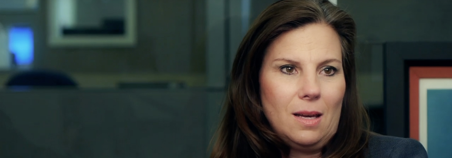
There’s an interesting Nancy Duarte interview on the Lewis Howes YouTube channel, where she describes the importance of storytelling and how to avoid some of the pitfalls in making presentations.
“Better PowerPoint Presentations” Video
Nancy’s company is one of the reasons why I started KEXINO. Duarte Design is probably more responsible than anyone else in making us all aware that slide presentations – for the presenter as well as for the audience – don’t have to be “death by bullet-point.”
Duarte Design themselves have posted a great YouTube video outlining five ways businesses and individuals can improve their slide presentations. Using just MS PowerPoint 2010 (and nothing else) this presentation gives you some great ground rules for the next time you have to make a presentation. Click on the image below to go to YouTube:
Sure, it shows off the new builds and transitions in PowerPoint 2010, which is probably why Microsoft asked Duarte to put something together in the first place. But for me what it really shows is that you can add such eye-candy without detriment to clearly conveying your message – if you know what you’re doing.

