Search Engine Optimization – SEO – isn’t just about keywords, description tags and the name that you use for images. It’s also about how your site is constructed and presented.
If you’re at all reliant on having your website rank well on Google search results, you’re probably already very aware of making sure that your site is optimized for viewing on mobile devices. Well Google have recently announced that they’re upping the stakes in that particular game.
Google have announced that as from the 21st of April 2015, your site’s “mobile-friendliness” is going to have a ‘significant impact’ (their words, not mine) on where your site will appear in Google search results. The change in the search algorithm is being applied worldwide, and across all languages.
What that means is that if Google doesn’t think that your site is particularly mobile-friendly, from April 21 your site isn’t going to rank as highly in search results (from mobile devices) as it does today.
To put it another way: if your competitor has a better mobile-optimized site than you do, they’ll appear higher-up in search results – all other things being equal.
Note that I said that “…if Google doesn’t think..” This has little to do with whether your site has been built with mobile devices in mind: It’s what Google sees that matters.
How Mobile-Friendly Is Your Site?
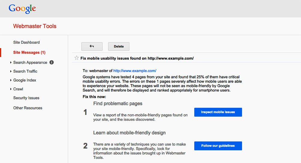
So how do you know if your site passes Google’s test? Well, if you have created a Google Search Console account (and if you haven’t, why on earth not?) you may have seen a warning message that looks something like this:

Clicking on the various links will give you a description of the issue as Google sees it, as well as links to guidelines to address them.
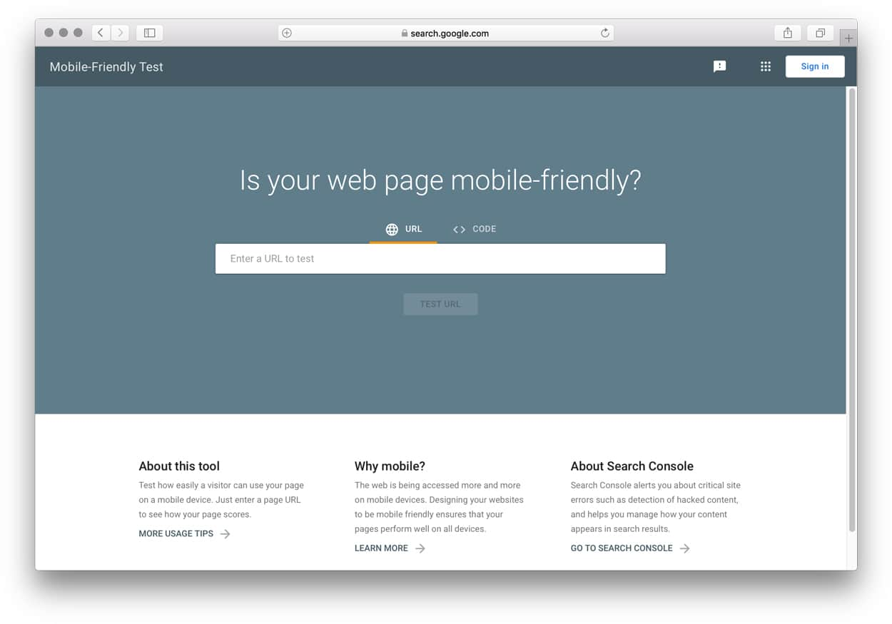
If you haven’t set up a Google Search Console account yet, then you can enter your site URL into Google’s Mobile Friendly Test page for a quick answer:

In addition, you might want to run your site through Google’s PageSpeeds Insights page. Not only will PageSpeed Insights give you a more thorough overview of what’s good and what’s not; but it will notify you of any technical issues with how your site is performing across desktop and mobile devices.
Not All Mobile-Friendly Sites Are Created Equal
Simply sticking your site on any old mobile-friendly framework doesn’t mean that you’ll pass Google’s tests. Google looks at every single page in isolation, so running a couple of pages through one of the test sites mentioned above doesn’t mean that your entire site will get a green light. Think about blog archive pages, landing pages, and even that cute custom 404 page that you had designed 5 years ago but have now all but forgotten.
“But I’ve bought a responsive website theme for my site, so I’m safe, right?” Not necessarily.
Optimizing for mobile isn’t just about shmushing text and images into variable-sized pages. There’s more to it than that – or at least there should be.
For example, what size text are you using on your site? What size text does that become when it’s shown on a tablet, or a phone? Google defines text as being too small when the font size is under 16 CSS pixels (which equates to something around 12pt text). If your text is displayed smaller than that, Google is going to fail you. More information on determining font sizes can be found here.
Then there’s how far apart buttons and menus are. if Google thinks they’re too close together when viewed on a mobile device, you’re going to get hit. More information can be found here.
Optimize Mobile Communications
Google says that 77% of mobile-based searches take place even when a desktop device is nearby. Even if most of your site traffic today isn’t from mobile, the changes that Google will put in place on April 21 will impact you.
So why not use the opportunity to re-evaluate how your site communicates your business value message to different users?
Desktop users are often more likely to read a greater amount of text than tablet users, who in turn may have more patience than mobile users.
Did you know that you can tailor your website’s messaging based upon the device on which it’s being viewed? So you could have short, sharp text for phone users, something more descriptive for tablet visitors, and something more elaborate for desktop readers.
Take a look at the text below on a big-screen device, like a laptop or desktop computer:
Now resize your browser window and see how the message changes as the size of the page reduces. Cool, huh?
There’s No Such Thing As A Mobile Website
At the heart of it all, I think, is that we need to stop pinning labels on what’s right for mobile, versus desktop. There’s no such thing as the “mobile web”, just as there isn’t a “desktop web”. All of the web is mobile, just as it’s all tablet, desktop, smartwatch and whatever else is coming down the pike.
The challenge is not simply optimizing the presentation of content for the device concerned. That’s the easy part. That’s a technical issue.
The bigger issue lies in presenting your message in empathy with the device on which it’s being viewed. Delivering relevant, optimized experiences based on the user expectations at that time.
Oh, and it’s probably a good time to get rid of that Flash intro once and for all.
Confused? To get a definitive confirmation whether your website is mobile friendly in the eyes of Google get in touch with us for a free site audit.
[UPDATE]
Google have announced that pages that display interstitial banner ads on mobile devices will also no longer be considered “mobile-friendly”.
Great, you say, no more ads covering things up. No more searching around for the “close” button so that you can get to the content you’re after.
However, it’s important to note that Google’s definition of “interstitial” is anything “… that hide(s) a significant amount of content on the transition from the search result page.”
Yes, that includes all those banner ads that temporarily block the content. But it may also include more legitimate interstitial modals such newsletter email sign-up forms. If your site is built to display a modal window that covers-up most of the viewing area on a mobile device, your site may be penalized by Google in terms of its mobile-friendliness.
ABOUT THE AUTHOR
Gee Ranasinha is CEO and founder of KEXINO. He's been a marketer since the days of 56K modems and AOL CDs, and lectures on marketing and behavioral science at two European business schools. An international speaker at various conferences and events, Gee was noted as one of the top 100 global business influencers by sage.com (those wonderful people who make financial software).
Originally from London, today Gee lives in a world of his own in Strasbourg, France, tolerated by his wife and teenage son.
Find out more about Gee at kexino.com/gee-ranasinha. Follow him on on LinkedIn at linkedin.com/in/ranasinha or Instagram at instagram.com/wearekexino.
Recent articles:
Why Business Still Worships Effort (And How It’s Quietly Killing Strategy)

The “Brand vs. Activation” Debate Is a Capital Allocation Failure

How Behavioral Science Thinking Improves Marketing Effectiveness

Dark Social: The Hidden Conversations Marketers Can’t See

Marketing In A Recession: How To Weather The Storm

How To Convince A Marketing Skeptic


